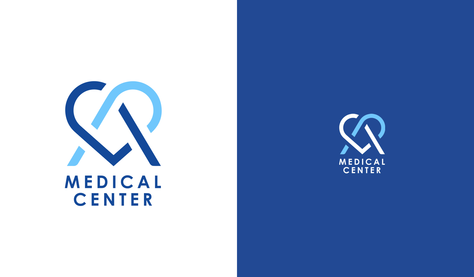
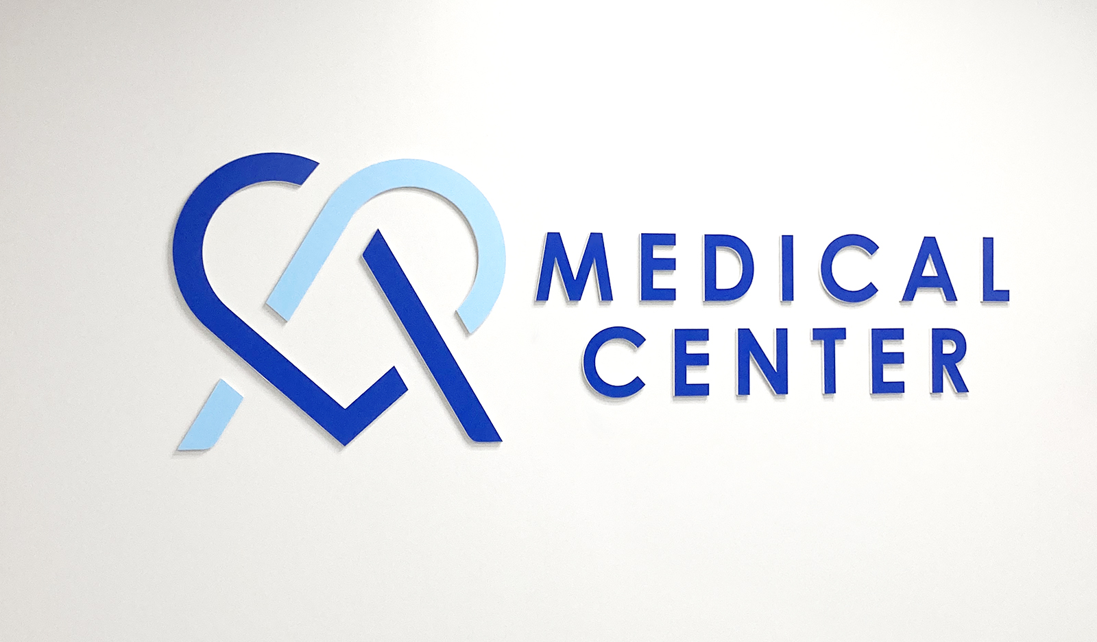
MEDICAL CENTER
The naming and logo for the private clinic, MEDICAL CENTER, embodies a harmonious fusion of creativity and professionalism. The design ingeniously incorporates the letters of “Medical,” skillfully intersecting them to form an elegant and captivating “M heart-shaped” emblem. This distinctive symbol not only conveys a sense of care and compassion but also signifies the essence of the medical field – a commitment to the well-being of individuals.
The dynamic and warm shape of the heart is complemented by a thoughtful choice of colours. The use of cold, clean hues establishes a sense of clinical precision and modernity, creating a striking contrast with the warm and inviting form of the heart. This juxtaposition not only adds visual interest but also symbolizes the balance between the clinical expertise and the compassionate care provided by MEDICAL CENTER.
The overall design encapsulates the clinic’s commitment to professionalism, warmth, and a holistic approach to healthcare. It is a visual representation of a healthcare facility that seamlessly blends cutting-edge medical practices with a heartfelt dedication to the well-being of its patients.
Task
Development from scratch of the naming and the visual identity
We’re a team of creatives who are excited about unique ideas and help companies to create amazing identities by crafting top-notch UI/UX.